

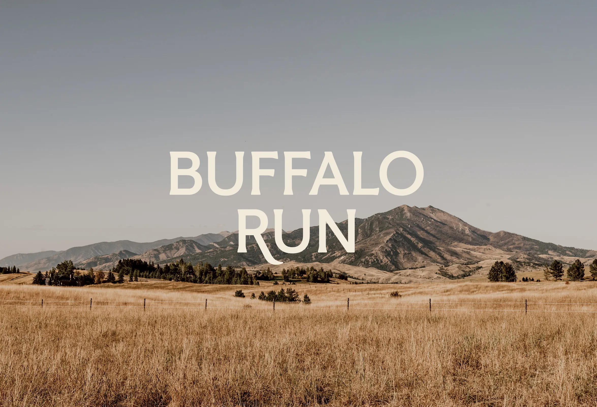
Buffalo Run
Add Project Name
Using Item Editor
Creative Strategy
Visual Identity System
Website Design
Brand Messaging
Print Materials
+ photography by
Chloe Nostrant
+ illustration by
Josh Diaz
- Once you add text, pics, etc
- You'll be able to edit it here
- On the Item Detail Page
- You will NOT be able to edit
- Placeholders
- Before adding content to the
- CMS item page
“TOGETHER WE FLY”
For us, it’s a metaphor for how we like to work. Part skill, part improvisation. Always paying attention. In the work. It doesn’t just look good, it feels good. We’ve always got a record on in the studio.
Not smooth jazz. Old jazz. Timeless jazz. For us, it’s a metaphor for how we like to work. Part skill, part improvisation. Always paying attention. In the work. It doesn’t just look good, it feels good.
For us, it’s a metaphor for how we like to work. Part skill, part improvisation. Always paying attention. In the work. It doesn’t just look good, it feels good. We’ve always got a record on in the studio. Not smooth jazz. Old jazz. Timeless jazz. For us, it’s a metaphor for how we like to work. Part skill, part improvisation. Always paying attention. In the work. It doesn’t just look good, it feels good.
"Made in the Mountains"
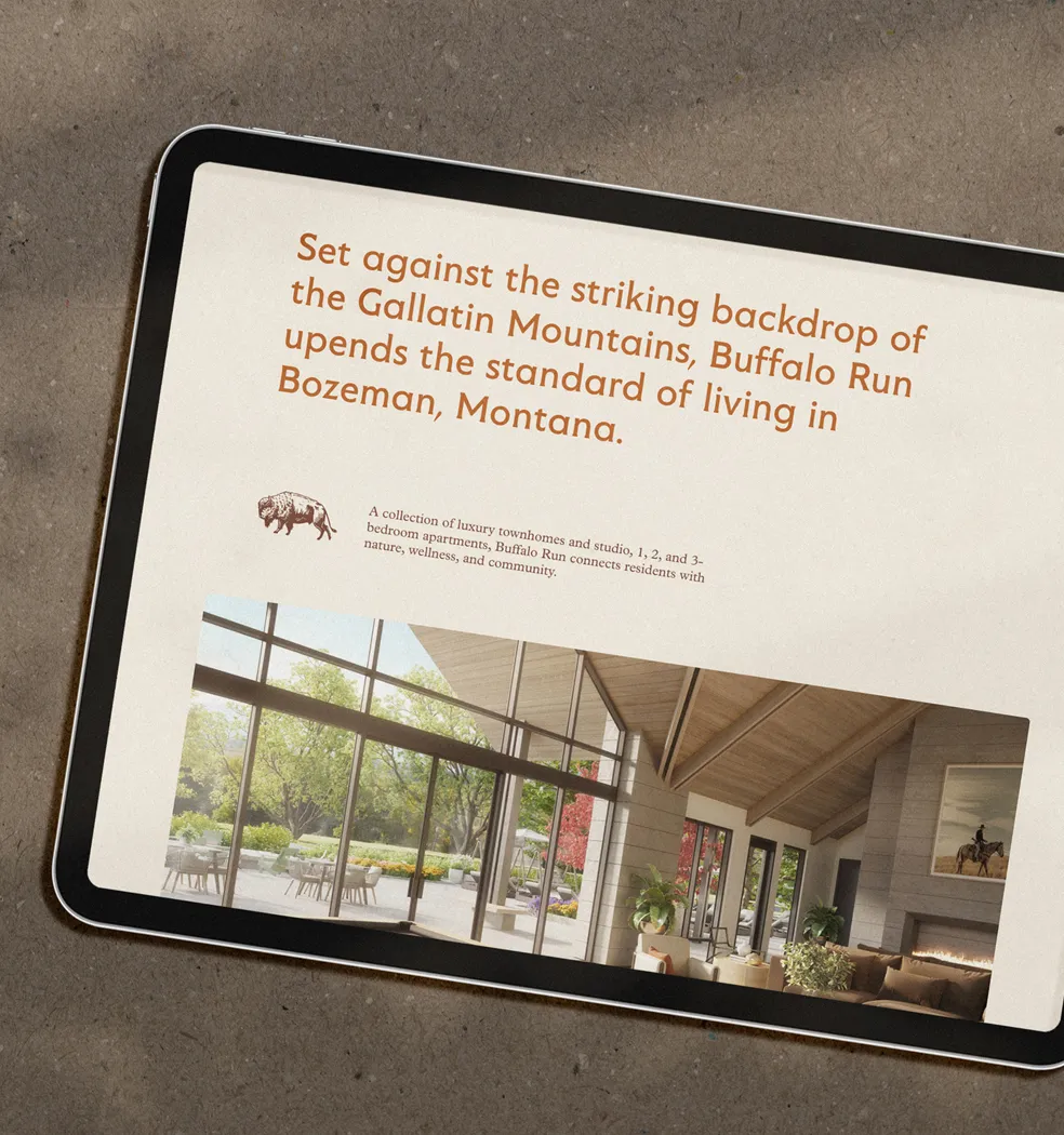
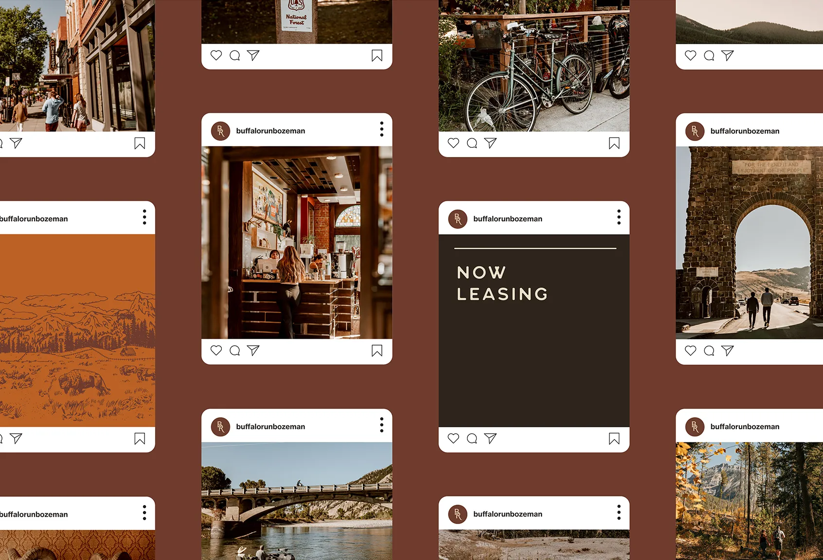
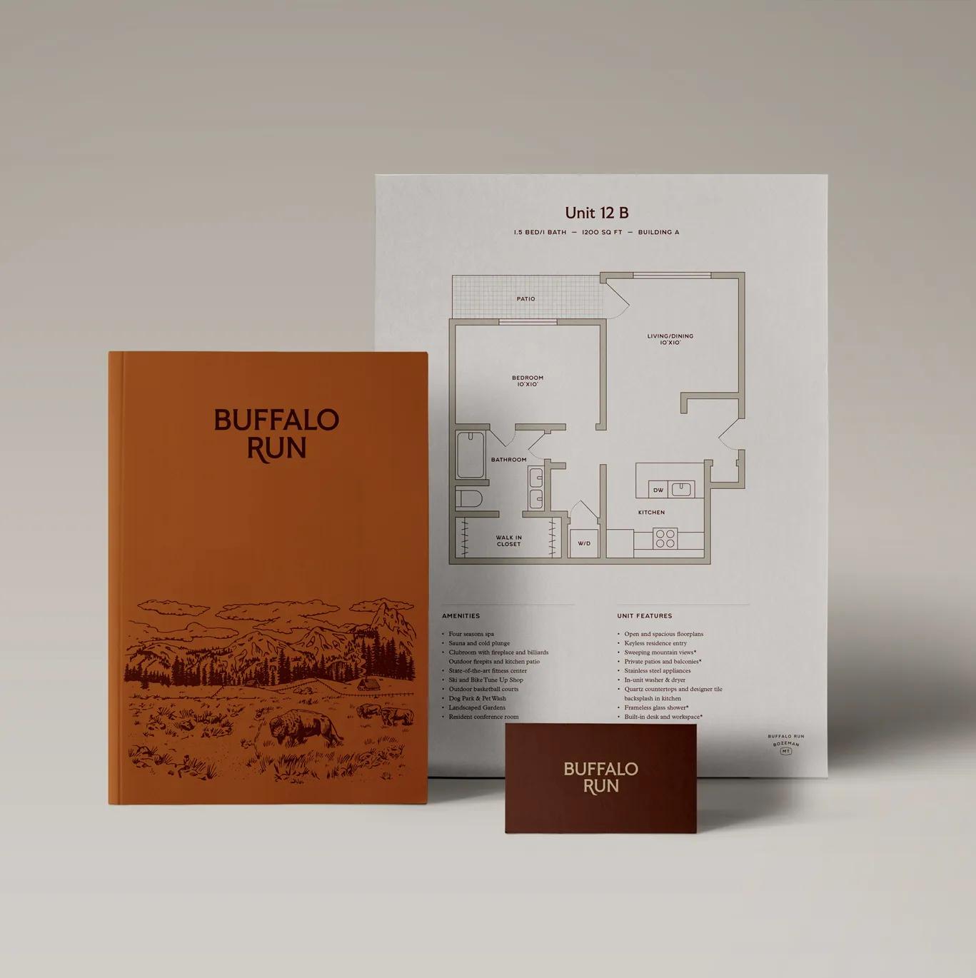
Buffalo Run is a high-end neighborhood built on the doorstep of the Gallatin Mountains in southwest Bozeman, Montana. Panoramic valley views of the Bridgers, Gallatin Range, and Madison Range provide a dramatic backdrop for residences with discerning taste.
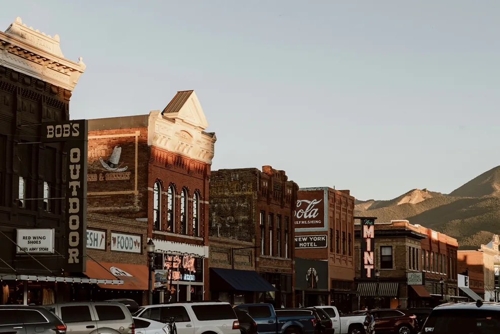
Our work was inspired just as much by the wild open space and rugged terrain surrounding the property as the local culture and pragmatic people who call this place home.

For us, it’s a metaphor for how we like to work. Part skill, part improvisation. Always paying attention. In the work. It doesn’t just look good, it feels good. We’ve always got a record on in the studio. Not smooth jazz. Old jazz. Timeless jazz.
– Louis Armstrong
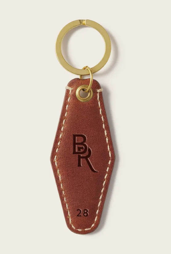
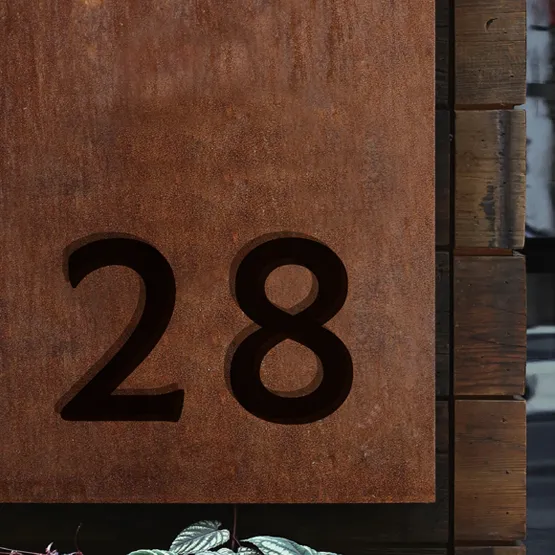
The identity leads with sturdy serif typography that blends a feeling of high-end sophistication and Western Americana. The color palette is a combination of warm and natural earth tones that feel at home between the mountain ranges and national parks.
We tapped local photographer Chloe Nostrant to capture Bozeman’s natural beauty and upscale downtown—and illustrator, Josh Diaz, to create some key assets with a uniquely hand-drawn, western feel.


For us, it’s a metaphor for how we like to work. Part skill, part improvisation. Always paying attention. In the work. It doesn’t just look good, it feels good. We’ve always got a record on in the studio. Not smooth jazz. Old jazz. Timeless jazz.
– Louis Armstrong
The identity leads with sturdy serif typography that blends a feeling of high-end sophistication and Western Americana. The color palette is a combination of warm and natural earth tones that feel at home between the mountain ranges and national parks.
We tapped local photographer Chloe Nostrant to capture Bozeman’s natural beauty and upscale downtown—and illustrator, Josh Diaz, to create some key assets with a uniquely hand-drawn, western feel.
For us, it’s a metaphor for how we like to work. Part skill, part improvisation. Always paying attention. In the work. It doesn’t just look good, it feels good. We’ve always got a record on in the studio. Not smooth jazz. Old jazz. Timeless jazz.
– Louis Armstrong
All together, the identity gives Buffalo Run a polished, distinctive look that feels at home in one of America’s most sought-after destinations.
For us, it’s a metaphor for how we like to work. Part skill, part improvisation. Always paying attention. In the work. It doesn’t just look good, it feels good. We’ve always got a record on in the studio. Not smooth jazz. Old jazz. Timeless jazz.
– Louis Armstrong
The identity leads with sturdy serif typography that blends a feeling of high-end sophistication and Western Americana. The color palette is a combination of warm and natural earth tones that feel at home between the mountain ranges and national parks.
We tapped local photographer Chloe Nostrant to capture Bozeman’s natural beauty and upscale downtown—and illustrator, Josh Diaz, to create some key assets with a uniquely hand-drawn, western feel.
For us, it’s a metaphor for how we like to work. Part skill, part improvisation. Always paying attention. In the work. It doesn’t just look good, it feels good. We’ve always got a record on in the studio. Not smooth jazz. Old jazz. Timeless jazz.
– Louis Armstrong
All together, the identity gives Buffalo Run a polished, distinctive look that feels at home in one of America’s most sought-after destinations.

For us, it’s a metaphor for how we like to work. Part skill, part improvisation. Always paying attention. In the work. It doesn’t just look good, it feels good. We’ve always got a record on in the studio. Not smooth jazz. Old jazz. Timeless jazz.
– Louis Armstrong
The identity leads with sturdy serif typography that blends a feeling of high-end sophistication and Western Americana. The color palette is a combination of warm and natural earth tones that feel at home between the mountain ranges and national parks.
We tapped local photographer Chloe Nostrant to capture Bozeman’s natural beauty and upscale downtown—and illustrator, Josh Diaz, to create some key assets with a uniquely hand-drawn, western feel.

For us, it’s a metaphor for how we like to work. Part skill, part improvisation. Always paying attention. In the work. It doesn’t just look good, it feels good. We’ve always got a record on in the studio. Not smooth jazz. Old jazz. Timeless jazz.
– Louis Armstrong
All together, the identity gives Buffalo Run a polished, distinctive look that feels at home in one of America’s most sought-after destinations.
For us, it’s a metaphor for how we like to work. Part skill, part improvisation. Always paying attention. In the work. It doesn’t just look good, it feels good. We’ve always got a record on in the studio. Not smooth jazz. Old jazz. Timeless jazz.
– Louis Armstrong
The identity leads with sturdy serif typography that blends a feeling of high-end sophistication and Western Americana. The color palette is a combination of warm and natural earth tones that feel at home between the mountain ranges and national parks.
We tapped local photographer Chloe Nostrant to capture Bozeman’s natural beauty and upscale downtown—and illustrator, Josh Diaz, to create some key assets with a uniquely hand-drawn, western feel.
For us, it’s a metaphor for how we like to work. Part skill, part improvisation. Always paying attention. In the work. It doesn’t just look good, it feels good. We’ve always got a record on in the studio. Not smooth jazz. Old jazz. Timeless jazz.
– Louis Armstrong
All together, the identity gives Buffalo Run a polished, distinctive look that feels at home in one of America’s most sought-after destinations.
For us, it’s a metaphor for how we like to work. Part skill, part improvisation. Always paying attention. In the work. It doesn’t just look good, it feels good. We’ve always got a record on in the studio. Not smooth jazz. Old jazz. Timeless jazz.
– Louis Armstrong