


Plotline
Add Project Name
Using Item Editor
Brand Naming
Product Naming
Visual Identity System
Print Materials
Website Strategy
Web Design
Brand Messaging Platform
Apparel Design
Presentation Templates
+ photography by
Jonathon Kohn
- Once you add text, pics, etc
- You'll be able to edit it here
- On the Item Detail Page
- You will NOT be able to edit
- Placeholders
- Before adding content to the
- CMS item page
“TOGETHER WE FLY”
For us, it’s a metaphor for how we like to work. Part skill, part improvisation. Always paying attention. In the work. It doesn’t just look good, it feels good. We’ve always got a record on in the studio.
Not smooth jazz. Old jazz. Timeless jazz. For us, it’s a metaphor for how we like to work. Part skill, part improvisation. Always paying attention. In the work. It doesn’t just look good, it feels good.
For us, it’s a metaphor for how we like to work. Part skill, part improvisation. Always paying attention. In the work. It doesn’t just look good, it feels good. We’ve always got a record on in the studio. Not smooth jazz. Old jazz. Timeless jazz. For us, it’s a metaphor for how we like to work. Part skill, part improvisation. Always paying attention. In the work. It doesn’t just look good, it feels good.
"Health & Care"
Plotline is a healthcare practice that offers medical expertise and personalized, proactive guidance for lifelong wellness. In a world of reactive medicine and overwhelming health information, Plotline is charting a different path. By combining cutting-edge science with deeply personal care to help you live well, your whole life long, this concierge medical partner is out to defy our unhealthy healthcare system.
As a new practice positioned at the intersection of health and care, we wanted to provide Dr. AJ Burandt with a brand name that captured his vision. Plotline was a great way to bridge the idea of tracking trends and health data with the idea of the overall design and story of your life. What’s the plot?


For us, it’s a metaphor for how we like to work. Part skill, part improvisation. Always paying attention. In the work. It doesn’t just look good, it feels good. We’ve always got a record on in the studio. Not smooth jazz. Old jazz. Timeless jazz.
– Louis Armstrong
Plotline’s identity system was built to make healthcare feel more human, accessible, and easier to navigate. The system is rooted in one of the simplest forms we’re all made of — the molecule.
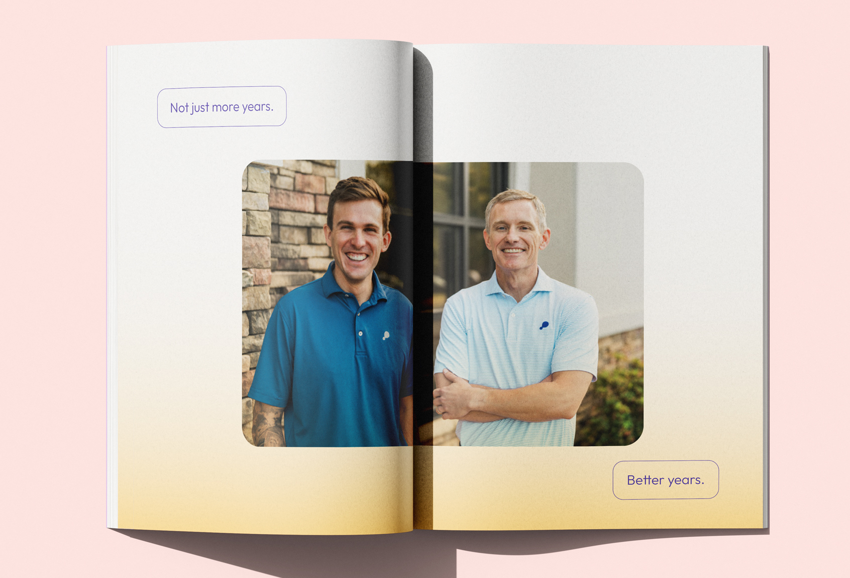
That shape begins in the logo and expands into a fluid visual language of connected circles and pathways that communicate personal growth, connection, and data flow. A bold violet palette gives the brand a fresh, distinctive point of view, while clean, modern typography keeps communication clear and calm. Brand photography leans into warm, natural moments that feel authentically human rather than clinical.
Together, these elements create an identity that feels intelligent and informative, while still remaining approachable, optimistic, and full of life.


For us, it’s a metaphor for how we like to work. Part skill, part improvisation. Always paying attention. In the work. It doesn’t just look good, it feels good. We’ve always got a record on in the studio. Not smooth jazz. Old jazz. Timeless jazz.
– Louis Armstrong
Plotline’s identity system was built to make healthcare feel more human, accessible, and easier to navigate. The system is rooted in one of the simplest forms we’re all made of — the molecule.
That shape begins in the logo and expands into a fluid visual language of connected circles and pathways that communicate personal growth, connection, and data flow. A bold violet palette gives the brand a fresh, distinctive point of view, while clean, modern typography keeps communication clear and calm. Brand photography leans into warm, natural moments that feel authentically human rather than clinical.
Together, these elements create an identity that feels intelligent and informative, while still remaining approachable, optimistic, and full of life.


For us, it’s a metaphor for how we like to work. Part skill, part improvisation. Always paying attention. In the work. It doesn’t just look good, it feels good. We’ve always got a record on in the studio. Not smooth jazz. Old jazz. Timeless jazz.
– Louis Armstrong
Plotline’s identity system was built to make healthcare feel more human, accessible, and easier to navigate. The system is rooted in one of the simplest forms we’re all made of — the molecule.
That shape begins in the logo and expands into a fluid visual language of connected circles and pathways that communicate personal growth, connection, and data flow. A bold violet palette gives the brand a fresh, distinctive point of view, while clean, modern typography keeps communication clear and calm. Brand photography leans into warm, natural moments that feel authentically human rather than clinical.
Together, these elements create an identity that feels intelligent and informative, while still remaining approachable, optimistic, and full of life.
For us, it’s a metaphor for how we like to work. Part skill, part improvisation. Always paying attention. In the work. It doesn’t just look good, it feels good. We’ve always got a record on in the studio. Not smooth jazz. Old jazz. Timeless jazz.
– Louis Armstrong
We wouldn’t exist without Proper. We started with them from day one of the company and I wouldn’t have it any other way. They gave us a bedrock foundation that we couldn’t have grown without. I genuinely looked forward to our meetings together and enjoyed every step of the process. I cannot count how many compliments and positive comments we get on our branding and we owe it all to the guys at Proper. Cannot recommend highly enough.
– Dr. AJ Burandt
For us, it’s a metaphor for how we like to work. Part skill, part improvisation. Always paying attention. In the work. It doesn’t just look good, it feels good. We’ve always got a record on in the studio. Not smooth jazz. Old jazz. Timeless jazz.
– Louis Armstrong
Plotline’s identity system was built to make healthcare feel more human, accessible, and easier to navigate. The system is rooted in one of the simplest forms we’re all made of — the molecule.
That shape begins in the logo and expands into a fluid visual language of connected circles and pathways that communicate personal growth, connection, and data flow. A bold violet palette gives the brand a fresh, distinctive point of view, while clean, modern typography keeps communication clear and calm. Brand photography leans into warm, natural moments that feel authentically human rather than clinical.
Together, these elements create an identity that feels intelligent and informative, while still remaining approachable, optimistic, and full of life.
For us, it’s a metaphor for how we like to work. Part skill, part improvisation. Always paying attention. In the work. It doesn’t just look good, it feels good. We’ve always got a record on in the studio. Not smooth jazz. Old jazz. Timeless jazz.
– Louis Armstrong
We wouldn’t exist without Proper. We started with them from day one of the company and I wouldn’t have it any other way. They gave us a bedrock foundation that we couldn’t have grown without. I genuinely looked forward to our meetings together and enjoyed every step of the process. I cannot count how many compliments and positive comments we get on our branding and we owe it all to the guys at Proper. Cannot recommend highly enough.
– Dr. AJ Burandt


For us, it’s a metaphor for how we like to work. Part skill, part improvisation. Always paying attention. In the work. It doesn’t just look good, it feels good. We’ve always got a record on in the studio. Not smooth jazz. Old jazz. Timeless jazz.
– Louis Armstrong
Plotline’s identity system was built to make healthcare feel more human, accessible, and easier to navigate. The system is rooted in one of the simplest forms we’re all made of — the molecule.
That shape begins in the logo and expands into a fluid visual language of connected circles and pathways that communicate personal growth, connection, and data flow. A bold violet palette gives the brand a fresh, distinctive point of view, while clean, modern typography keeps communication clear and calm. Brand photography leans into warm, natural moments that feel authentically human rather than clinical.
Together, these elements create an identity that feels intelligent and informative, while still remaining approachable, optimistic, and full of life.

For us, it’s a metaphor for how we like to work. Part skill, part improvisation. Always paying attention. In the work. It doesn’t just look good, it feels good. We’ve always got a record on in the studio. Not smooth jazz. Old jazz. Timeless jazz.
– Louis Armstrong
We wouldn’t exist without Proper. We started with them from day one of the company and I wouldn’t have it any other way. They gave us a bedrock foundation that we couldn’t have grown without. I genuinely looked forward to our meetings together and enjoyed every step of the process. I cannot count how many compliments and positive comments we get on our branding and we owe it all to the guys at Proper. Cannot recommend highly enough.
– Dr. AJ Burandt

For us, it’s a metaphor for how we like to work. Part skill, part improvisation. Always paying attention. In the work. It doesn’t just look good, it feels good. We’ve always got a record on in the studio. Not smooth jazz. Old jazz. Timeless jazz.
– Louis Armstrong
Plotline’s identity system was built to make healthcare feel more human, accessible, and easier to navigate. The system is rooted in one of the simplest forms we’re all made of — the molecule.
That shape begins in the logo and expands into a fluid visual language of connected circles and pathways that communicate personal growth, connection, and data flow. A bold violet palette gives the brand a fresh, distinctive point of view, while clean, modern typography keeps communication clear and calm. Brand photography leans into warm, natural moments that feel authentically human rather than clinical.
Together, these elements create an identity that feels intelligent and informative, while still remaining approachable, optimistic, and full of life.
For us, it’s a metaphor for how we like to work. Part skill, part improvisation. Always paying attention. In the work. It doesn’t just look good, it feels good. We’ve always got a record on in the studio. Not smooth jazz. Old jazz. Timeless jazz.
– Louis Armstrong
We wouldn’t exist without Proper. We started with them from day one of the company and I wouldn’t have it any other way. They gave us a bedrock foundation that we couldn’t have grown without. I genuinely looked forward to our meetings together and enjoyed every step of the process. I cannot count how many compliments and positive comments we get on our branding and we owe it all to the guys at Proper. Cannot recommend highly enough.
– Dr. AJ Burandt
For us, it’s a metaphor for how we like to work. Part skill, part improvisation. Always paying attention. In the work. It doesn’t just look good, it feels good. We’ve always got a record on in the studio. Not smooth jazz. Old jazz. Timeless jazz.
– Louis Armstrong