

Provvista
Add Project Name
Using Item Editor
Creative Strategy
Visual Identity System
Brand Messaging
Packaging
- Once you add text, pics, etc
- You'll be able to edit it here
- On the Item Detail Page
- You will NOT be able to edit
- Placeholders
- Before adding content to the
- CMS item page
“TOGETHER WE FLY”
For us, it’s a metaphor for how we like to work. Part skill, part improvisation. Always paying attention. In the work. It doesn’t just look good, it feels good. We’ve always got a record on in the studio.
Not smooth jazz. Old jazz. Timeless jazz. For us, it’s a metaphor for how we like to work. Part skill, part improvisation. Always paying attention. In the work. It doesn’t just look good, it feels good.
For us, it’s a metaphor for how we like to work. Part skill, part improvisation. Always paying attention. In the work. It doesn’t just look good, it feels good. We’ve always got a record on in the studio. Not smooth jazz. Old jazz. Timeless jazz. For us, it’s a metaphor for how we like to work. Part skill, part improvisation. Always paying attention. In the work. It doesn’t just look good, it feels good.
"Legacy of Provision"
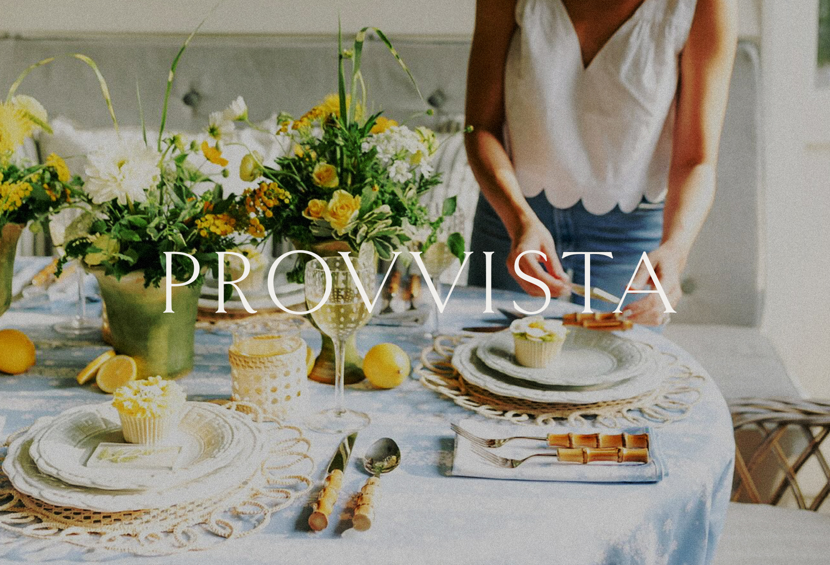
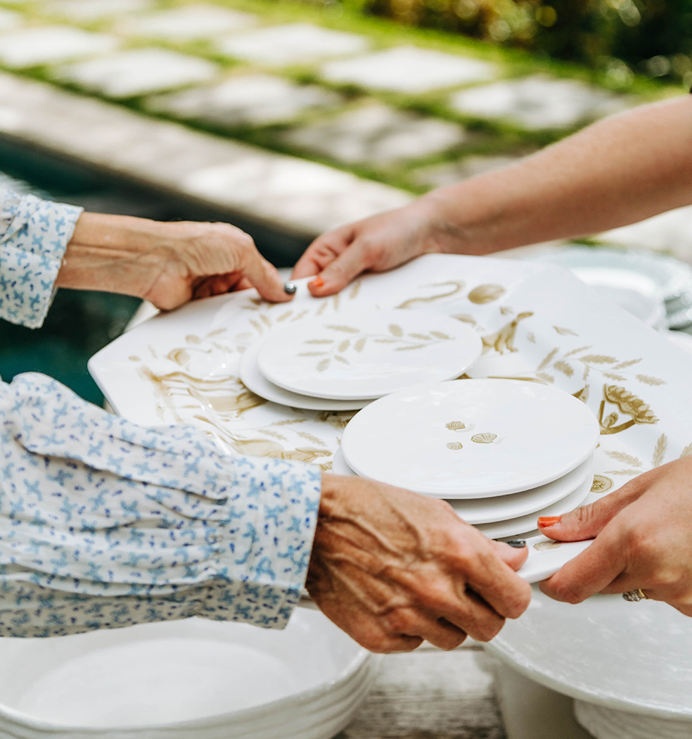
Provvista began as a vision to create beautiful, timeless dinnerware for family and friends — pieces made to be used and loved. Passed down proudly from parents to kids, to their kids, to their kids — on and on.
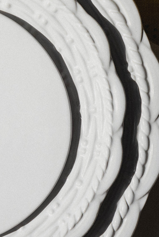
Their elegant collections draw from centuries of craft and culture, designed to feel enduring rather than trend-driven. They sit comfortably alongside family heirlooms, creating an artfully layered table and a sense of continuity between past and present.

For us, it’s a metaphor for how we like to work. Part skill, part improvisation. Always paying attention. In the work. It doesn’t just look good, it feels good. We’ve always got a record on in the studio. Not smooth jazz. Old jazz. Timeless jazz.
– Louis Armstrong
We set out to evolve the Provvista identity to reflect that balance: a brand rooted in tradition, but shaped with a modern sensibility. It needed to feel crafted and time-honoring, yet playful and human enough for today’s hosts and occasions.
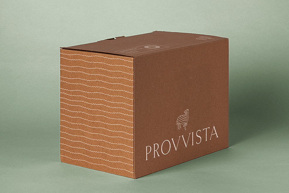
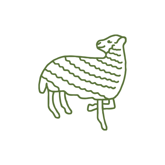
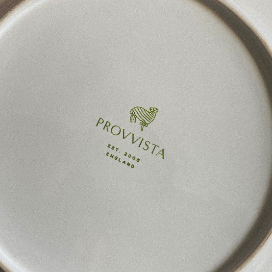
When we discovered a lamb in the company archives, we knew we had found the thread that could tie the system together.


For us, it’s a metaphor for how we like to work. Part skill, part improvisation. Always paying attention. In the work. It doesn’t just look good, it feels good. We’ve always got a record on in the studio. Not smooth jazz. Old jazz. Timeless jazz.
– Louis Armstrong
We set out to evolve the Provvista identity to reflect that balance: a brand rooted in tradition, but shaped with a modern sensibility. It needed to feel crafted and time-honoring, yet playful and human enough for today’s hosts and occasions.
When we discovered a lamb in the company archives, we knew we had found the thread that could tie the system together.
For us, it’s a metaphor for how we like to work. Part skill, part improvisation. Always paying attention. In the work. It doesn’t just look good, it feels good. We’ve always got a record on in the studio. Not smooth jazz. Old jazz. Timeless jazz.
– Louis Armstrong
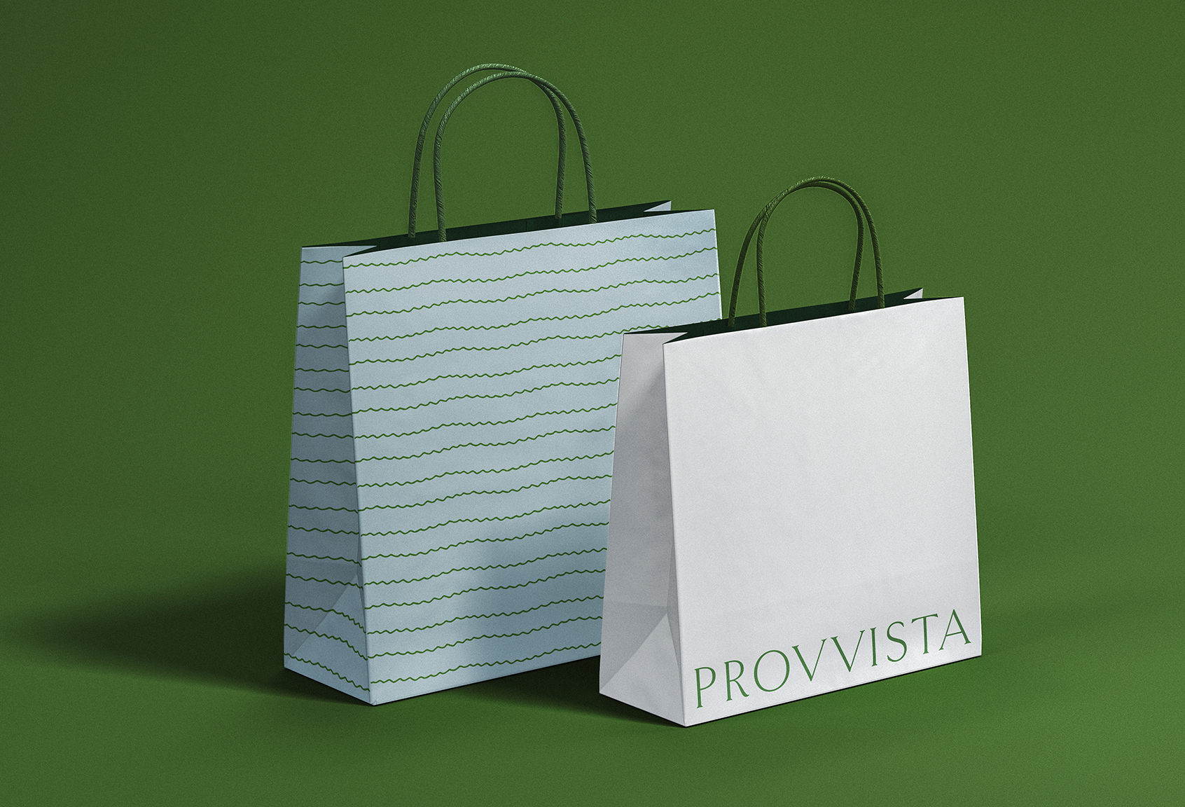
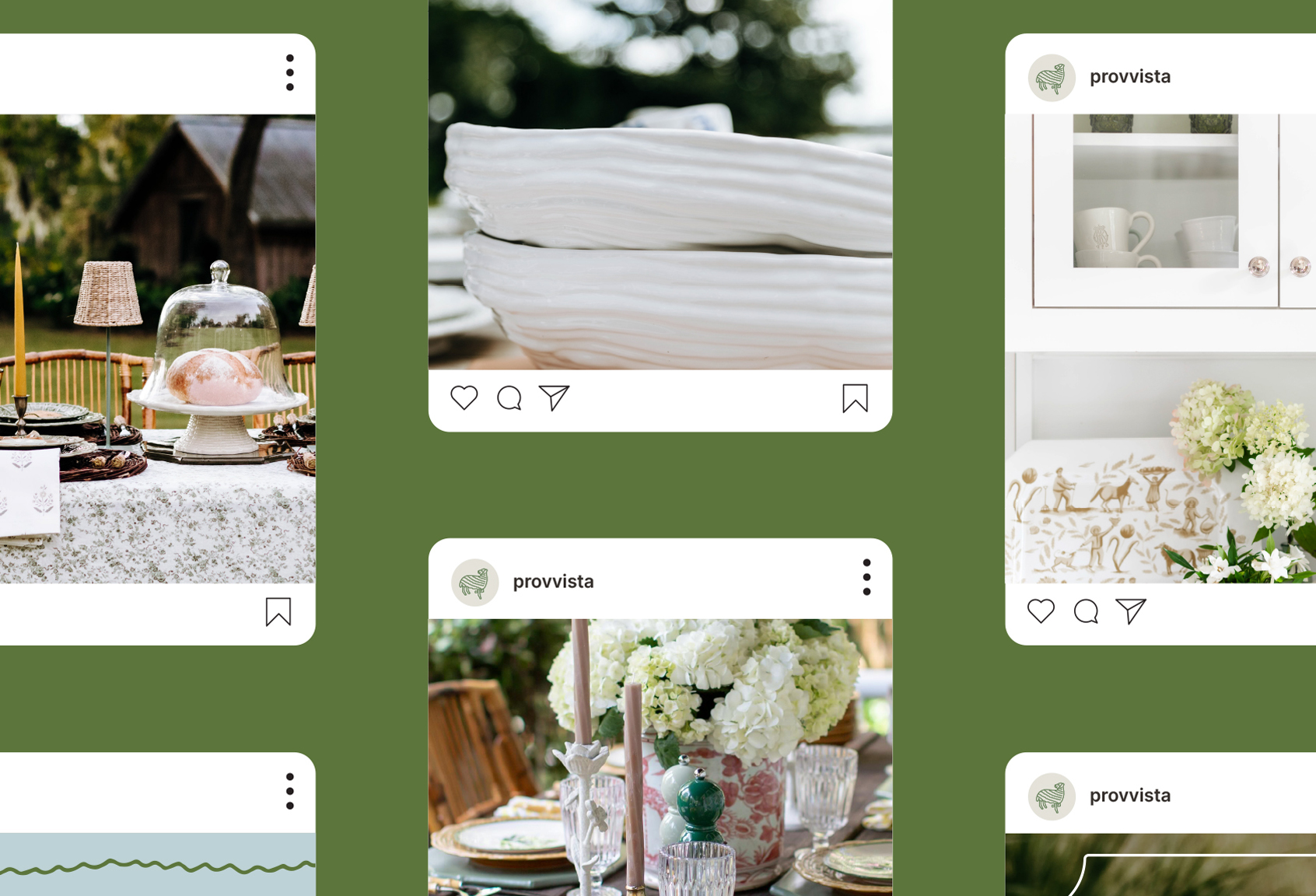
A hand-drawn lamb became our maker’s mark — a symbol of provision, heritage, and soft familiarity. It also informed a whimsically-textured pattern used across packaging and print materials.
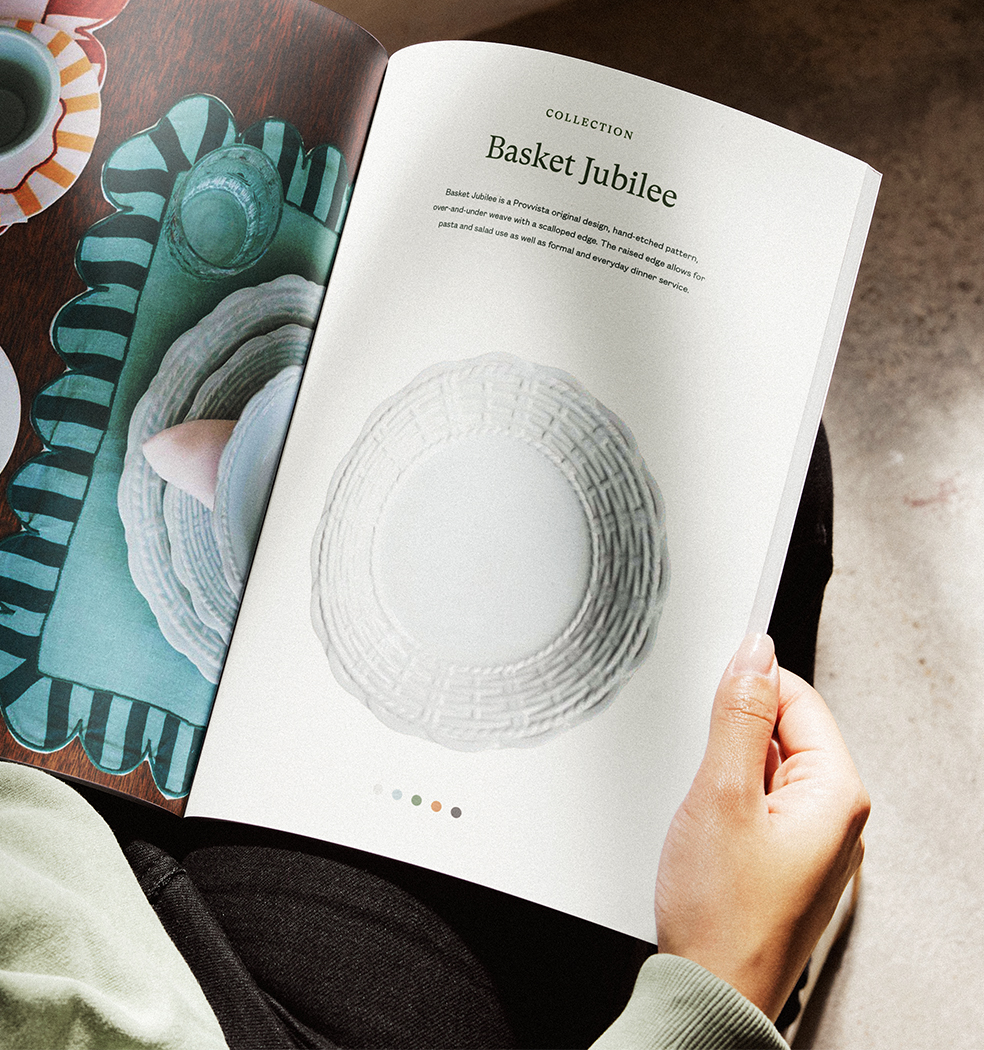
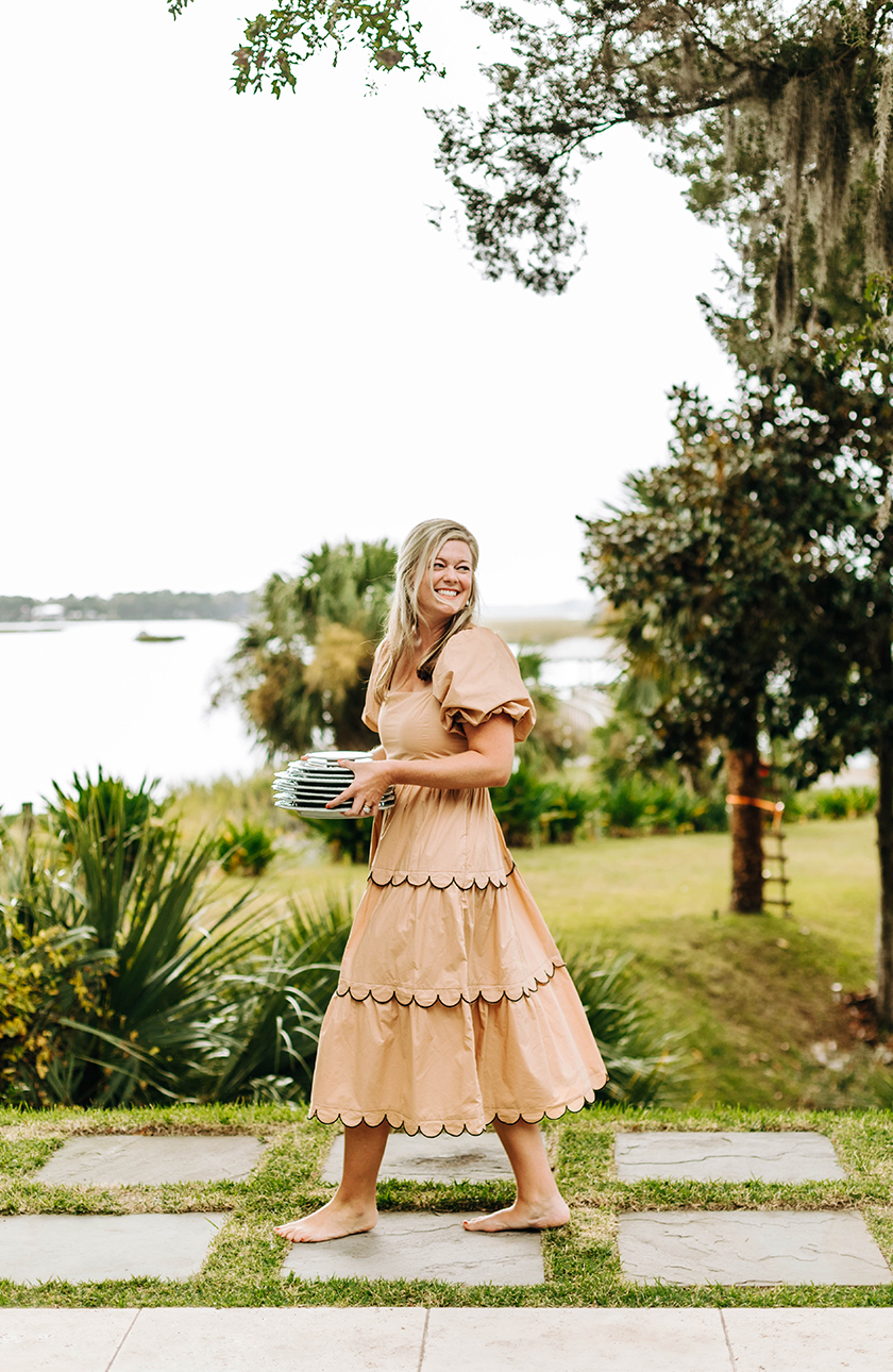
We paired olive green, drawn from the company’s historic palette, with brighter pastels to create a refined but approachable color palette. A combination of serif and sans-serif typography brought together tradition and clarity, while the photography celebrates both the craftsmanship of the product and the joy of gathering around it.
For us, it’s a metaphor for how we like to work. Part skill, part improvisation. Always paying attention. In the work. It doesn’t just look good, it feels good. We’ve always got a record on in the studio. Not smooth jazz. Old jazz. Timeless jazz.
– Louis Armstrong
We set out to evolve the Provvista identity to reflect that balance: a brand rooted in tradition, but shaped with a modern sensibility. It needed to feel crafted and time-honoring, yet playful and human enough for today’s hosts and occasions.
When we discovered a lamb in the company archives, we knew we had found the thread that could tie the system together.
For us, it’s a metaphor for how we like to work. Part skill, part improvisation. Always paying attention. In the work. It doesn’t just look good, it feels good. We’ve always got a record on in the studio. Not smooth jazz. Old jazz. Timeless jazz.
– Louis Armstrong
A hand-drawn lamb became our maker’s mark — a symbol of provision, heritage, and soft familiarity. It also informed a whimsically-textured pattern used across packaging and print materials.
We paired olive green, drawn from the company’s historic palette, with brighter pastels to create a refined but approachable color palette. A combination of serif and sans-serif typography brought together tradition and clarity, while the photography celebrates both the craftsmanship of the product and the joy of gathering around it.
For us, it’s a metaphor for how we like to work. Part skill, part improvisation. Always paying attention. In the work. It doesn’t just look good, it feels good. We’ve always got a record on in the studio. Not smooth jazz. Old jazz. Timeless jazz.
– Louis Armstrong
We set out to evolve the Provvista identity to reflect that balance: a brand rooted in tradition, but shaped with a modern sensibility. It needed to feel crafted and time-honoring, yet playful and human enough for today’s hosts and occasions.
When we discovered a lamb in the company archives, we knew we had found the thread that could tie the system together.

For us, it’s a metaphor for how we like to work. Part skill, part improvisation. Always paying attention. In the work. It doesn’t just look good, it feels good. We’ve always got a record on in the studio. Not smooth jazz. Old jazz. Timeless jazz.
– Louis Armstrong
A hand-drawn lamb became our maker’s mark — a symbol of provision, heritage, and soft familiarity. It also informed a whimsically-textured pattern used across packaging and print materials.
We paired olive green, drawn from the company’s historic palette, with brighter pastels to create a refined but approachable color palette. A combination of serif and sans-serif typography brought together tradition and clarity, while the photography celebrates both the craftsmanship of the product and the joy of gathering around it.
For us, it’s a metaphor for how we like to work. Part skill, part improvisation. Always paying attention. In the work. It doesn’t just look good, it feels good. We’ve always got a record on in the studio. Not smooth jazz. Old jazz. Timeless jazz.
– Louis Armstrong
We set out to evolve the Provvista identity to reflect that balance: a brand rooted in tradition, but shaped with a modern sensibility. It needed to feel crafted and time-honoring, yet playful and human enough for today’s hosts and occasions.
When we discovered a lamb in the company archives, we knew we had found the thread that could tie the system together.
For us, it’s a metaphor for how we like to work. Part skill, part improvisation. Always paying attention. In the work. It doesn’t just look good, it feels good. We’ve always got a record on in the studio. Not smooth jazz. Old jazz. Timeless jazz.
– Louis Armstrong
A hand-drawn lamb became our maker’s mark — a symbol of provision, heritage, and soft familiarity. It also informed a whimsically-textured pattern used across packaging and print materials.
We paired olive green, drawn from the company’s historic palette, with brighter pastels to create a refined but approachable color palette. A combination of serif and sans-serif typography brought together tradition and clarity, while the photography celebrates both the craftsmanship of the product and the joy of gathering around it.
For us, it’s a metaphor for how we like to work. Part skill, part improvisation. Always paying attention. In the work. It doesn’t just look good, it feels good. We’ve always got a record on in the studio. Not smooth jazz. Old jazz. Timeless jazz.
– Louis Armstrong