

TrueMile
Add Project Name
Using Item Editor
Brand Strategy
Brand Naming
Visual Identity System
Website Design
Credit Card Design
Print Materials
Presentation Design
- Once you add text, pics, etc
- You'll be able to edit it here
- On the Item Detail Page
- You will NOT be able to edit
- Placeholders
- Before adding content to the
- CMS item page
“TOGETHER WE FLY”
For us, it’s a metaphor for how we like to work. Part skill, part improvisation. Always paying attention. In the work. It doesn’t just look good, it feels good. We’ve always got a record on in the studio.
Not smooth jazz. Old jazz. Timeless jazz. For us, it’s a metaphor for how we like to work. Part skill, part improvisation. Always paying attention. In the work. It doesn’t just look good, it feels good.
For us, it’s a metaphor for how we like to work. Part skill, part improvisation. Always paying attention. In the work. It doesn’t just look good, it feels good. We’ve always got a record on in the studio. Not smooth jazz. Old jazz. Timeless jazz. For us, it’s a metaphor for how we like to work. Part skill, part improvisation. Always paying attention. In the work. It doesn’t just look good, it feels good.
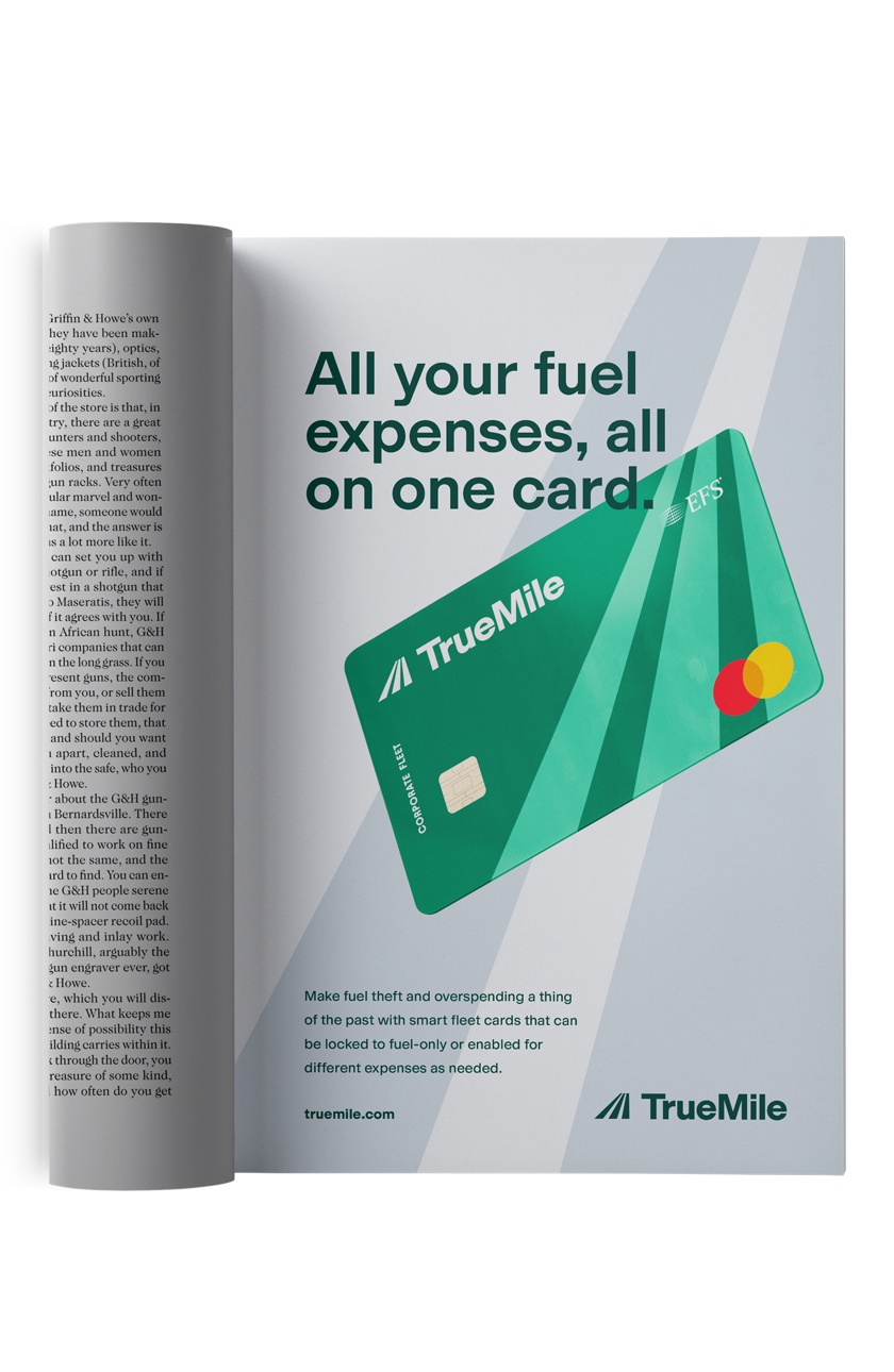
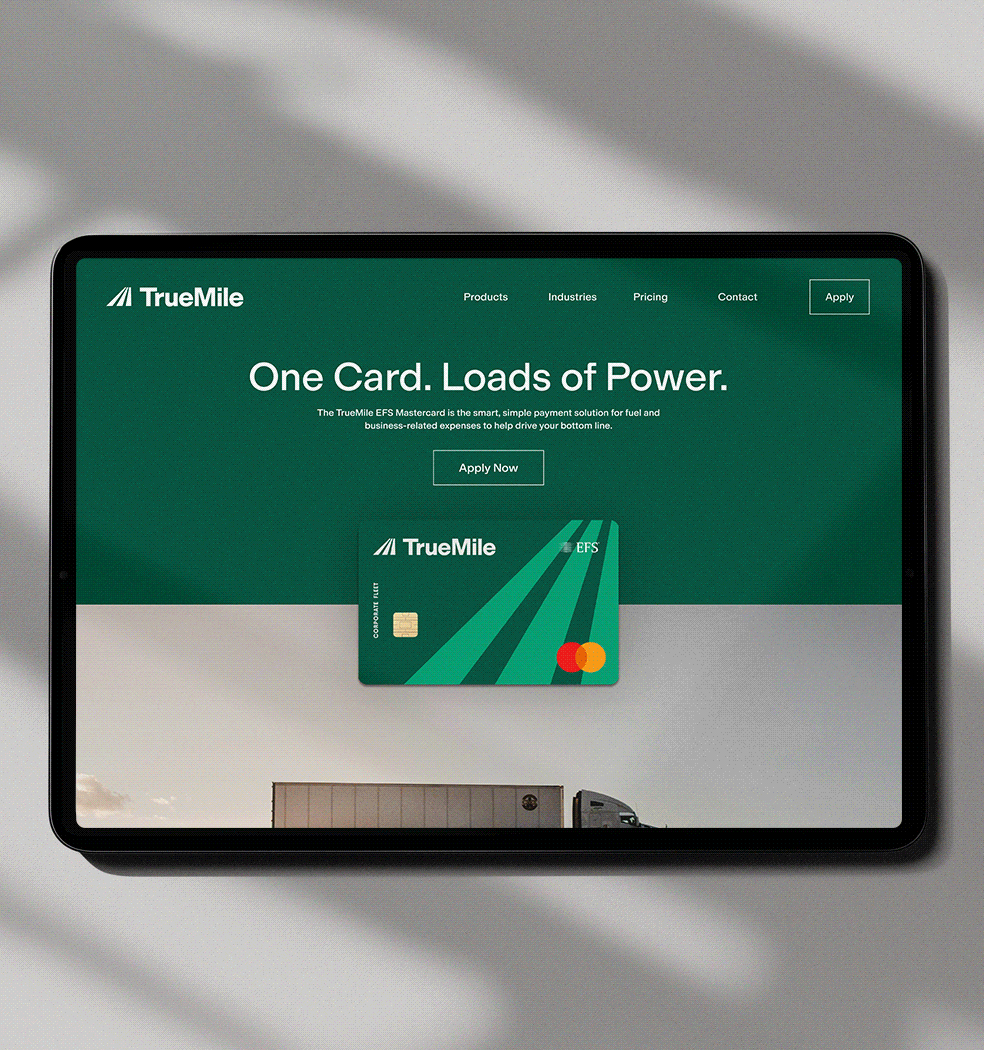
"ONE CARD. LOADS OF POWER."
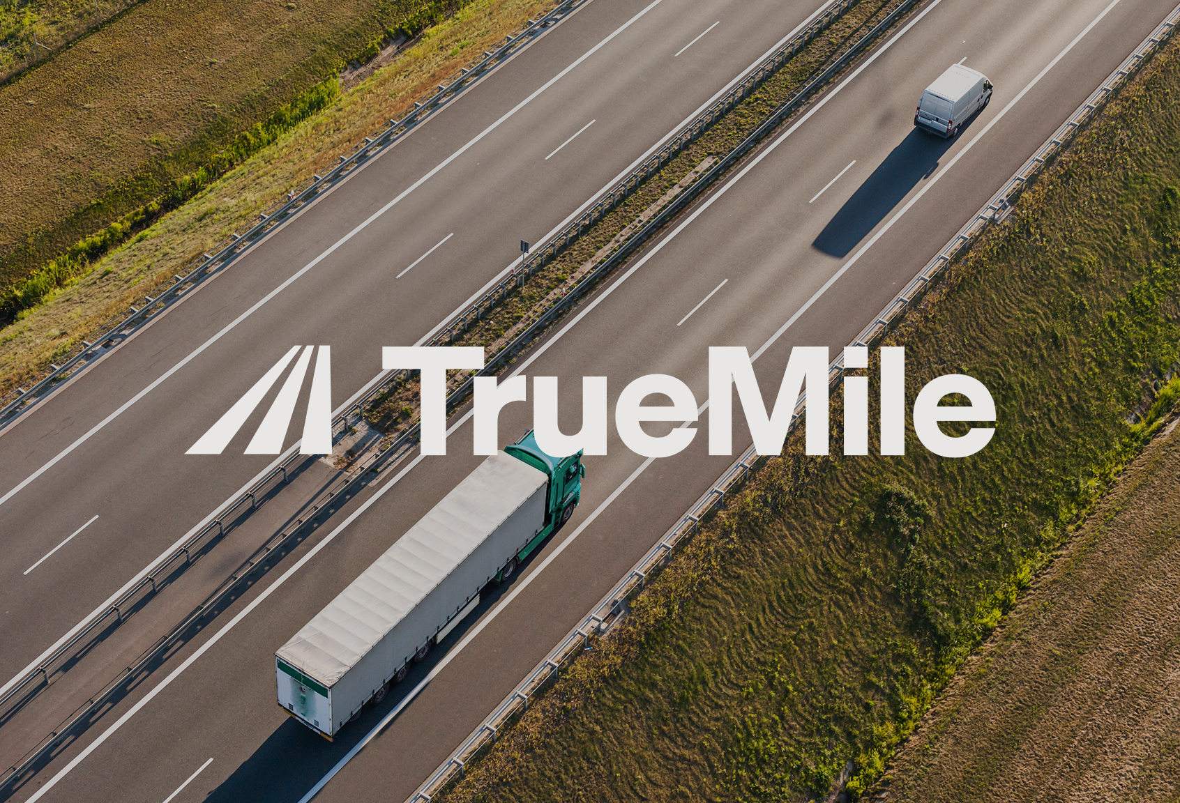
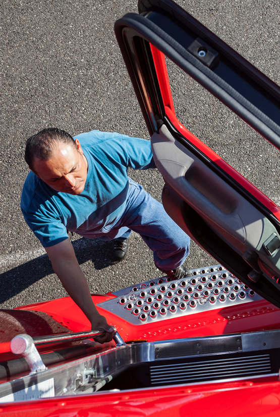
The TrueMile card program is the smart, simple payment solution for fuel and business-related expenses to help fleet managers and truck drivers get the most mileage out of their bottom line. TrueMile can be used at over 12,000 EFS-accepting truck stops with an additional 75 partner locations across 13 states. TrueMile’s nationwide network is built to deliver savings, security, customer care, and business intelligence all in one card.
The team behind TrueMile asked us to develop a brand strategy that could position the card program as a leading solution in an already saturated space.

For us, it’s a metaphor for how we like to work. Part skill, part improvisation. Always paying attention. In the work. It doesn’t just look good, it feels good. We’ve always got a record on in the studio. Not smooth jazz. Old jazz. Timeless jazz.
– Louis Armstrong
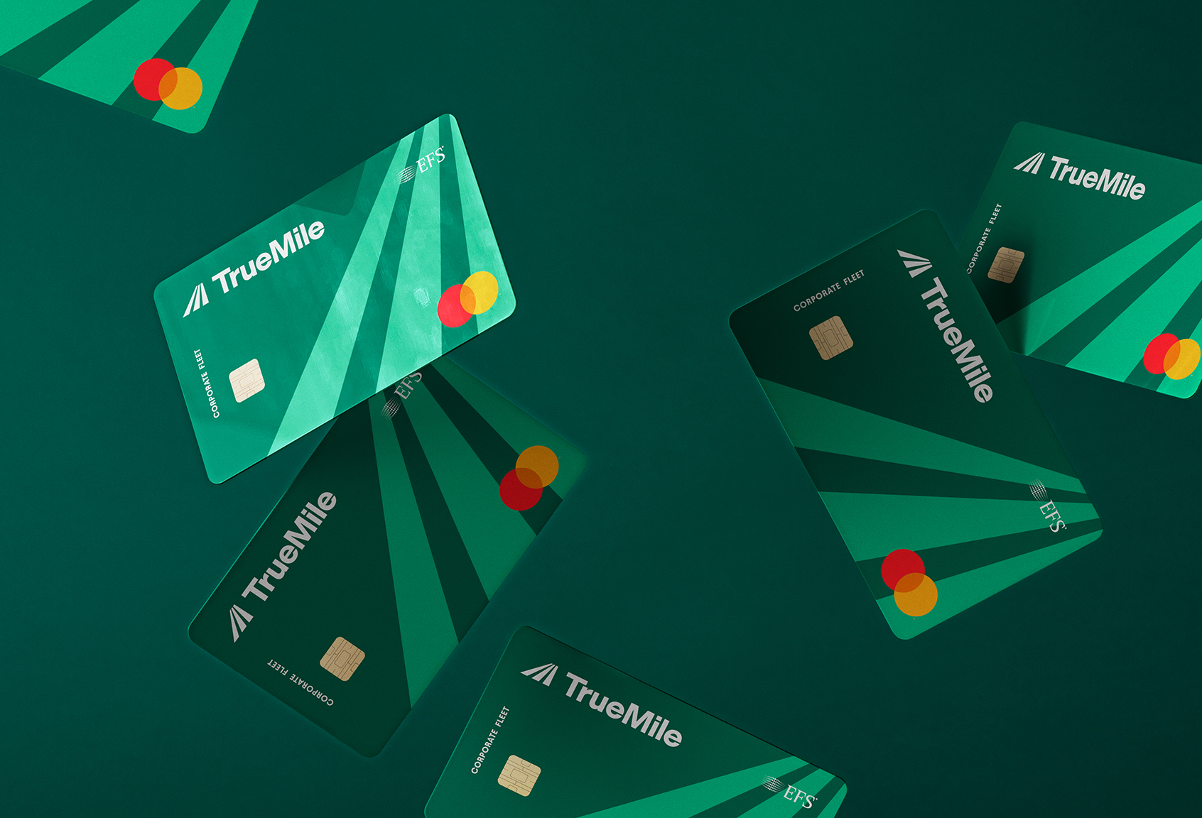
We developed the name and visual identity to reflect a brand that feels strong, solid, and smart. The system is intentionally simple and durable, designed to work consistently across a wide range of applications while maintaining a clear point of view.
The primary mark is bold yet understated, using a subtle roadway gesture to signal direction, progress, and long-term growth. We chose a single, hardworking typeface that brings clarity and cohesion across messaging, headlines, and body copy.
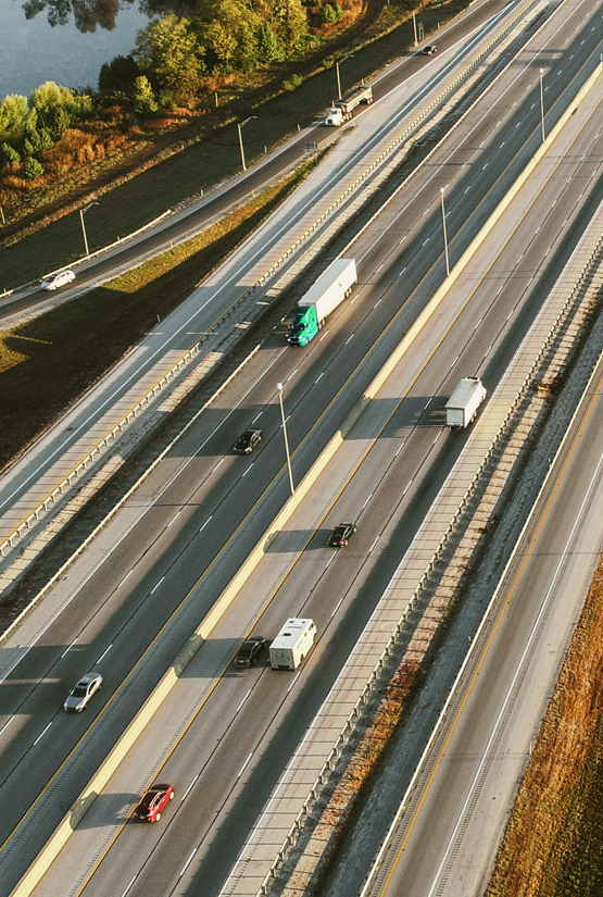
Aerial photography introduces a broader perspective — a visual metaphor to see the full financial picture, while a complementary palette of greens reinforces the brand’s position as a modern, trusted business partner.


For us, it’s a metaphor for how we like to work. Part skill, part improvisation. Always paying attention. In the work. It doesn’t just look good, it feels good. We’ve always got a record on in the studio. Not smooth jazz. Old jazz. Timeless jazz.
– Louis Armstrong
We developed the name and visual identity to reflect a brand that feels strong, solid, and smart. The system is intentionally simple and durable, designed to work consistently across a wide range of applications while maintaining a clear point of view.
The primary mark is bold yet understated, using a subtle roadway gesture to signal direction, progress, and long-term growth. We chose a single, hardworking typeface that brings clarity and cohesion across messaging, headlines, and body copy.
Aerial photography introduces a broader perspective — a visual metaphor to see the full financial picture, while a complementary palette of greens reinforces the brand’s position as a modern, trusted business partner.
For us, it’s a metaphor for how we like to work. Part skill, part improvisation. Always paying attention. In the work. It doesn’t just look good, it feels good. We’ve always got a record on in the studio. Not smooth jazz. Old jazz. Timeless jazz.
– Louis Armstrong
Working with Proper was a seamless and highly collaborative experience. From the outset, their team demonstrated a strong understanding of the TrueMile brand and our business objectives, translating complex program details into clear, compelling creative.
– Nick LaFalce
For us, it’s a metaphor for how we like to work. Part skill, part improvisation. Always paying attention. In the work. It doesn’t just look good, it feels good. We’ve always got a record on in the studio. Not smooth jazz. Old jazz. Timeless jazz.
– Louis Armstrong
We developed the name and visual identity to reflect a brand that feels strong, solid, and smart. The system is intentionally simple and durable, designed to work consistently across a wide range of applications while maintaining a clear point of view.
The primary mark is bold yet understated, using a subtle roadway gesture to signal direction, progress, and long-term growth. We chose a single, hardworking typeface that brings clarity and cohesion across messaging, headlines, and body copy.
Aerial photography introduces a broader perspective — a visual metaphor to see the full financial picture, while a complementary palette of greens reinforces the brand’s position as a modern, trusted business partner.

For us, it’s a metaphor for how we like to work. Part skill, part improvisation. Always paying attention. In the work. It doesn’t just look good, it feels good. We’ve always got a record on in the studio. Not smooth jazz. Old jazz. Timeless jazz.
– Louis Armstrong
Working with Proper was a seamless and highly collaborative experience. From the outset, their team demonstrated a strong understanding of the TrueMile brand and our business objectives, translating complex program details into clear, compelling creative.
– Nick LaFalce
For us, it’s a metaphor for how we like to work. Part skill, part improvisation. Always paying attention. In the work. It doesn’t just look good, it feels good. We’ve always got a record on in the studio. Not smooth jazz. Old jazz. Timeless jazz.
– Louis Armstrong
We developed the name and visual identity to reflect a brand that feels strong, solid, and smart. The system is intentionally simple and durable, designed to work consistently across a wide range of applications while maintaining a clear point of view.
The primary mark is bold yet understated, using a subtle roadway gesture to signal direction, progress, and long-term growth. We chose a single, hardworking typeface that brings clarity and cohesion across messaging, headlines, and body copy.
Aerial photography introduces a broader perspective — a visual metaphor to see the full financial picture, while a complementary palette of greens reinforces the brand’s position as a modern, trusted business partner.
For us, it’s a metaphor for how we like to work. Part skill, part improvisation. Always paying attention. In the work. It doesn’t just look good, it feels good. We’ve always got a record on in the studio. Not smooth jazz. Old jazz. Timeless jazz.
– Louis Armstrong
Working with Proper was a seamless and highly collaborative experience. From the outset, their team demonstrated a strong understanding of the TrueMile brand and our business objectives, translating complex program details into clear, compelling creative.
– Nick LaFalce
For us, it’s a metaphor for how we like to work. Part skill, part improvisation. Always paying attention. In the work. It doesn’t just look good, it feels good. We’ve always got a record on in the studio. Not smooth jazz. Old jazz. Timeless jazz.
– Louis Armstrong